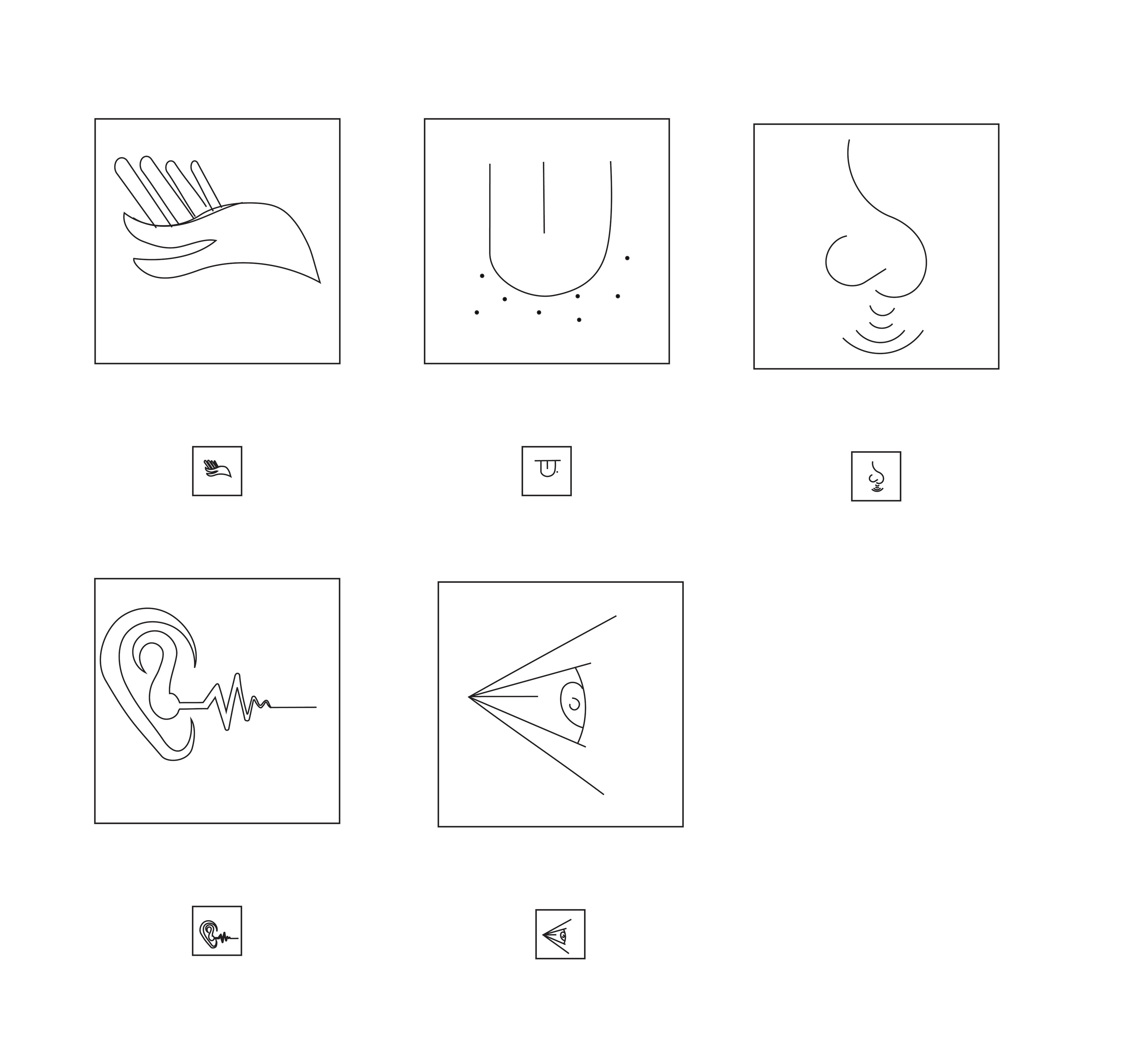
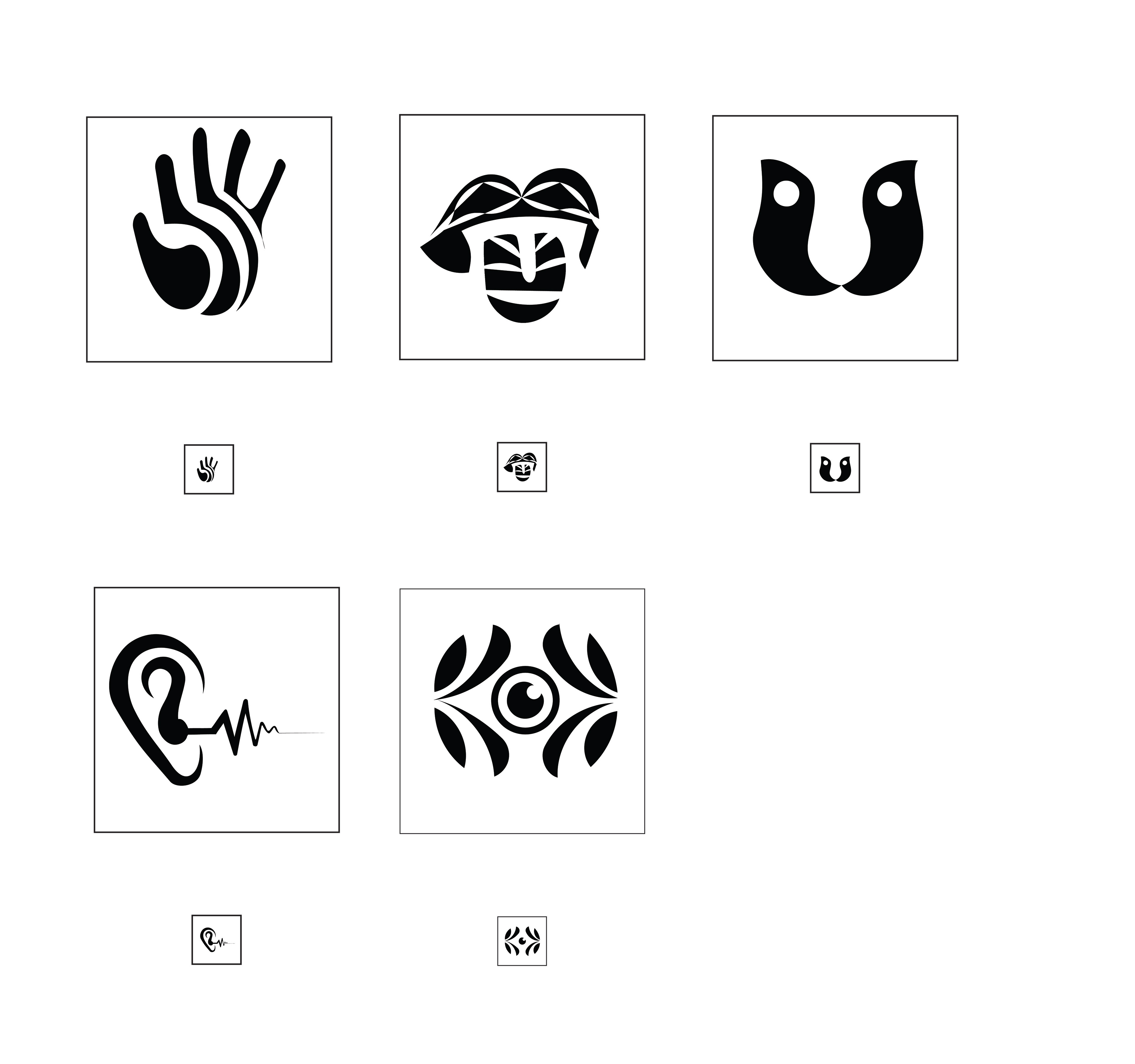
This project's objective was to develop a group of symbols that visually represent one of the five human senses established through their verb. I designed five unique compositions using a series of stylistic and systematic techniques to establish a monochromatic and color sequence. This symbol set conveys the visual representations for tasting, smelling, touching, seeing, and hearing through graphic compositions.
Initially, I intended to compose a series of minimalistic symbols structured through thin line weights techniques. Upon reflection on my ideation process, I created opposing compositions to differentiate their features and began to develop a new approach. Revolutionizing my initial concept, I used the hand as my guide to develop the rest of my set- demonstrating bold, circular line weights, using negative space and open contrast.
I began my ideation process by composing a series of minimalistic graphic elements that visually represented the verbs of each of the five human senses. I incorporated objects and other additional elements to support different approaches to considerable themes.


My series of compositions throughout the iteration process.
Additionally to create our symbol set, our instructor provided a series of categories for our compositions to represent informatively in real-world circumstances. I was assigned the category of Pediatric relief. I chose the hand/touch as my final symbol due to the simplistic and seamless appeal that embodies a straightforward strategy. The circular motion of the hand incorporates contrast and inner dimension and texture within the hand.
After composing three alternative color sequences, I selected the most cohesive palette that would display "pediatric characteristics."
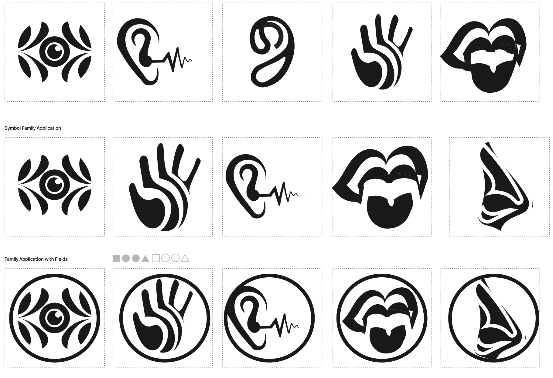
Final Symbol Set: Black&White/Color
I selected one of my symbols within my set to pursue further. From this selection, I formulated three new symbols that would overall expand the meaning within the series.
First Iteration
Second Iteration
I experimented with multiple concepts and iterations. I also composed different concepts for some of my other symbols of the five senses to gather an alternate perspective on the intended application.
To conclude the project, we were given the option to place our chosen symbol and our directional arrow acquired with our symbol set in a mock-up template to visually represent our symbol in a real-world scenario.
