This project involved the development of a comprehensive symbol system. Included is the symbols’ promotion, implementation and education for the Franklin Park Conservatory and Botanical Gardens. Focusing on the research, process methodology, symbol grid/logic legibility/scale, user comprehension testing, writing and demonstrating possible applications.
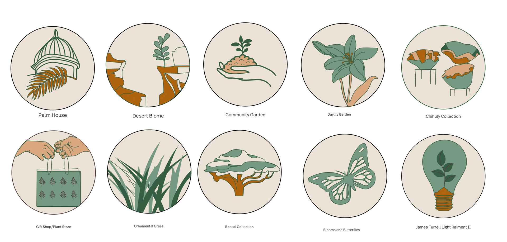
For an overview, the Franklin Park Conservatory and Botanical Gardens is a botanical garden and conservatory located in Columbus, Ohio. It’s a horticultural and educational institution showcasing exotic plant collections, special exhibitions, and Dale Chihuly artworks. Based on collections displayed at the Franklin Park Conservatory, I created one symbol representing the eight collections representing the promotion and education for this institution.
My reference categories were the following:
- Palm House -Community Garden -Ornamental Grass
-Desert Biome. -Gift Shop/Plant Store -Bonsai Collection
-Daylily Garden -Blooms and Butterflies -James Turrell Light Raiment 2
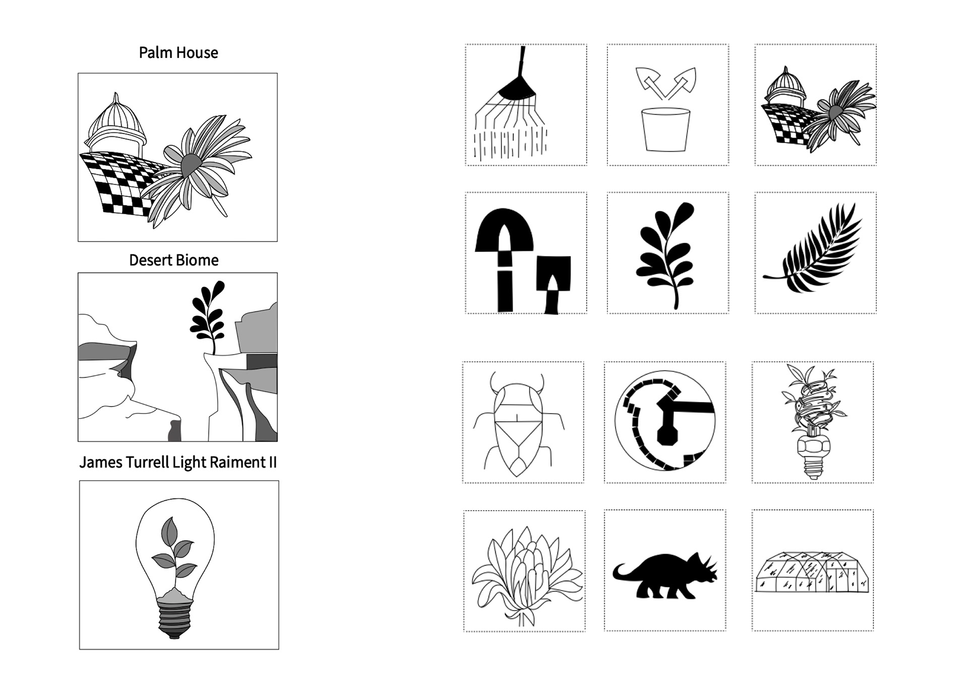
My initial iterations.
I continued to expand my research in the discovery process by creating multiple iterations. I began with thin line weights and shallow depth and began to experiment with bold line weights and high contrast.

Rough draft/First symbol set.

Final Monochromatic Symbol Set.
Final Color Symbol Set.
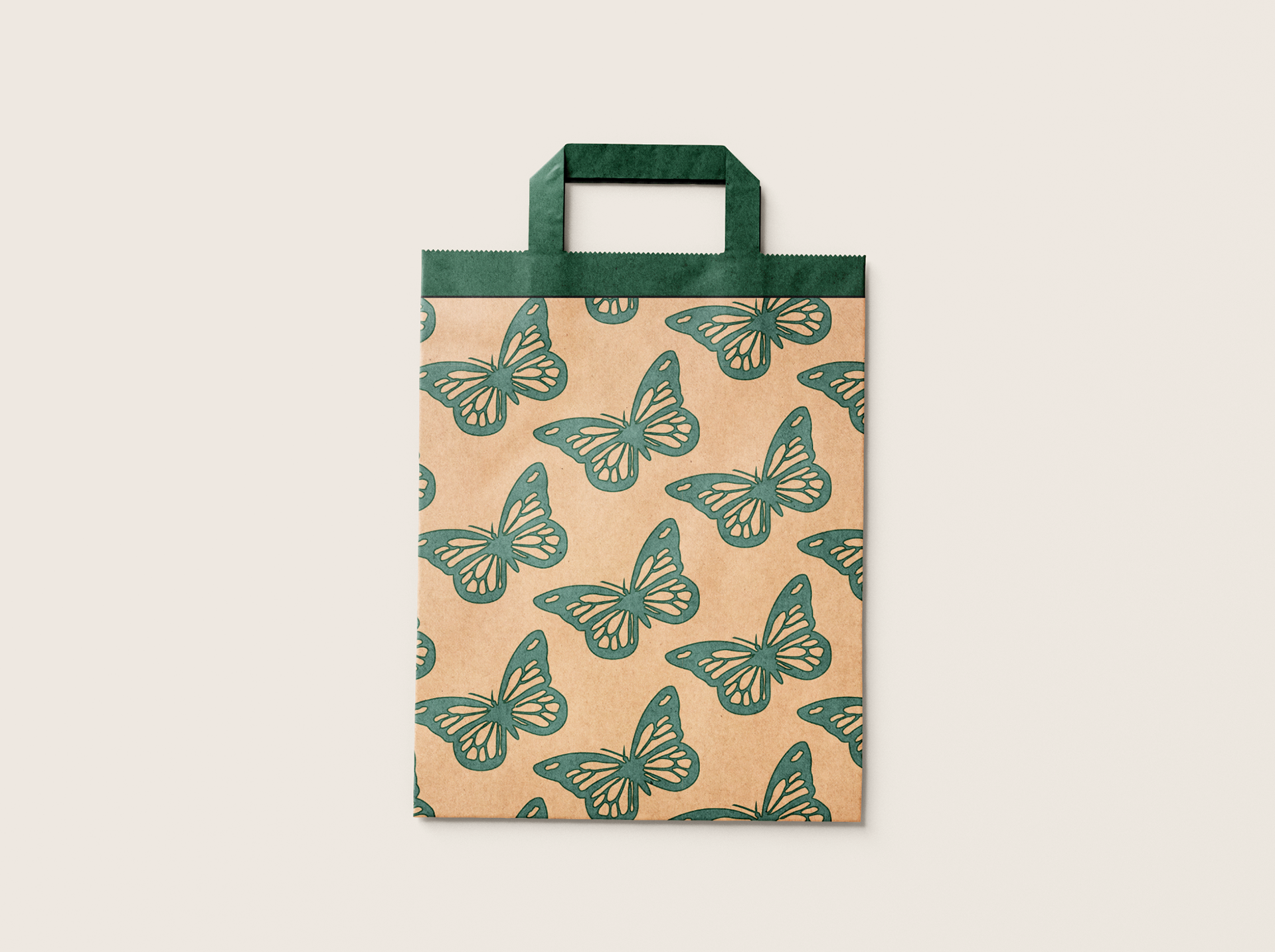
After I composed my symbol set through a monochromatic and color sequence, I was able to proceed into the promotion portion of the project where I would choose one of the symbols from my set and construct it into a pattern. I configured four cohesive patterns using three symbols.

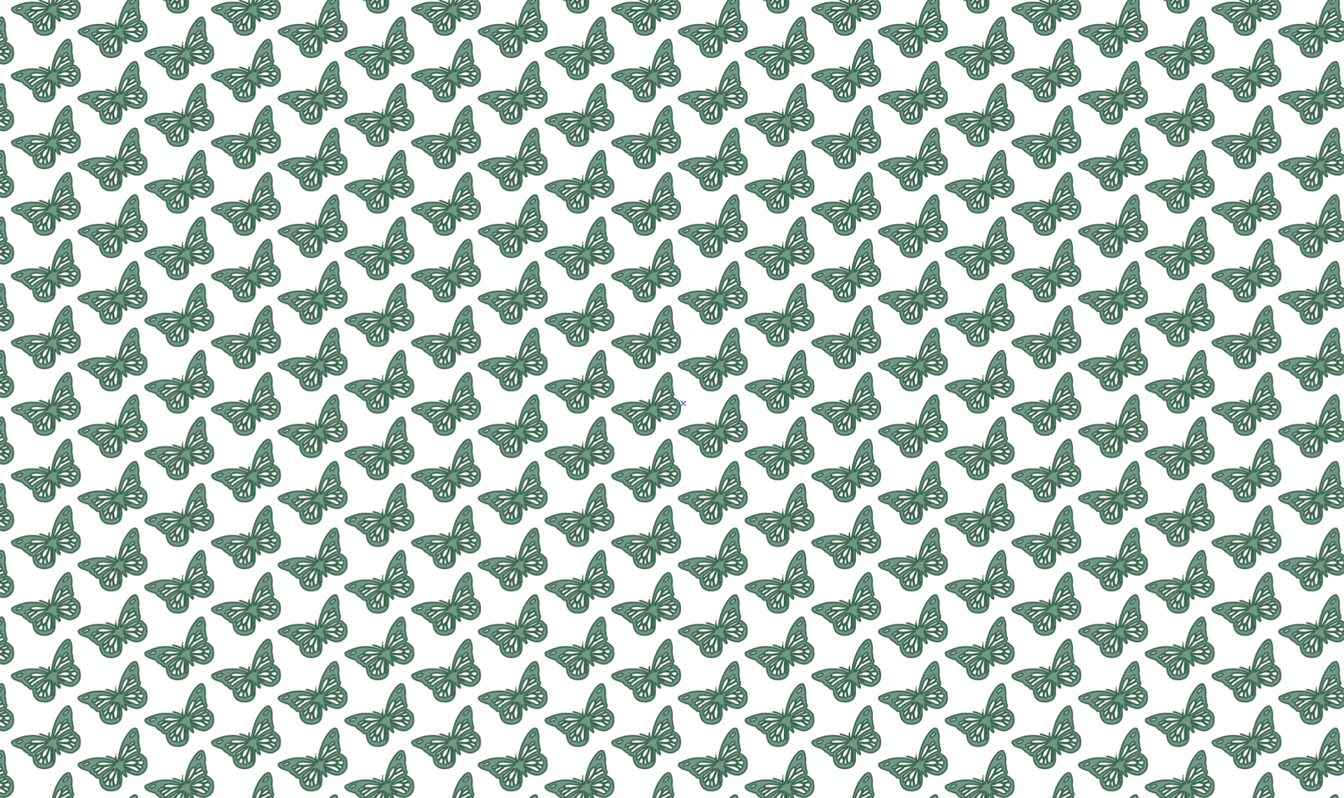
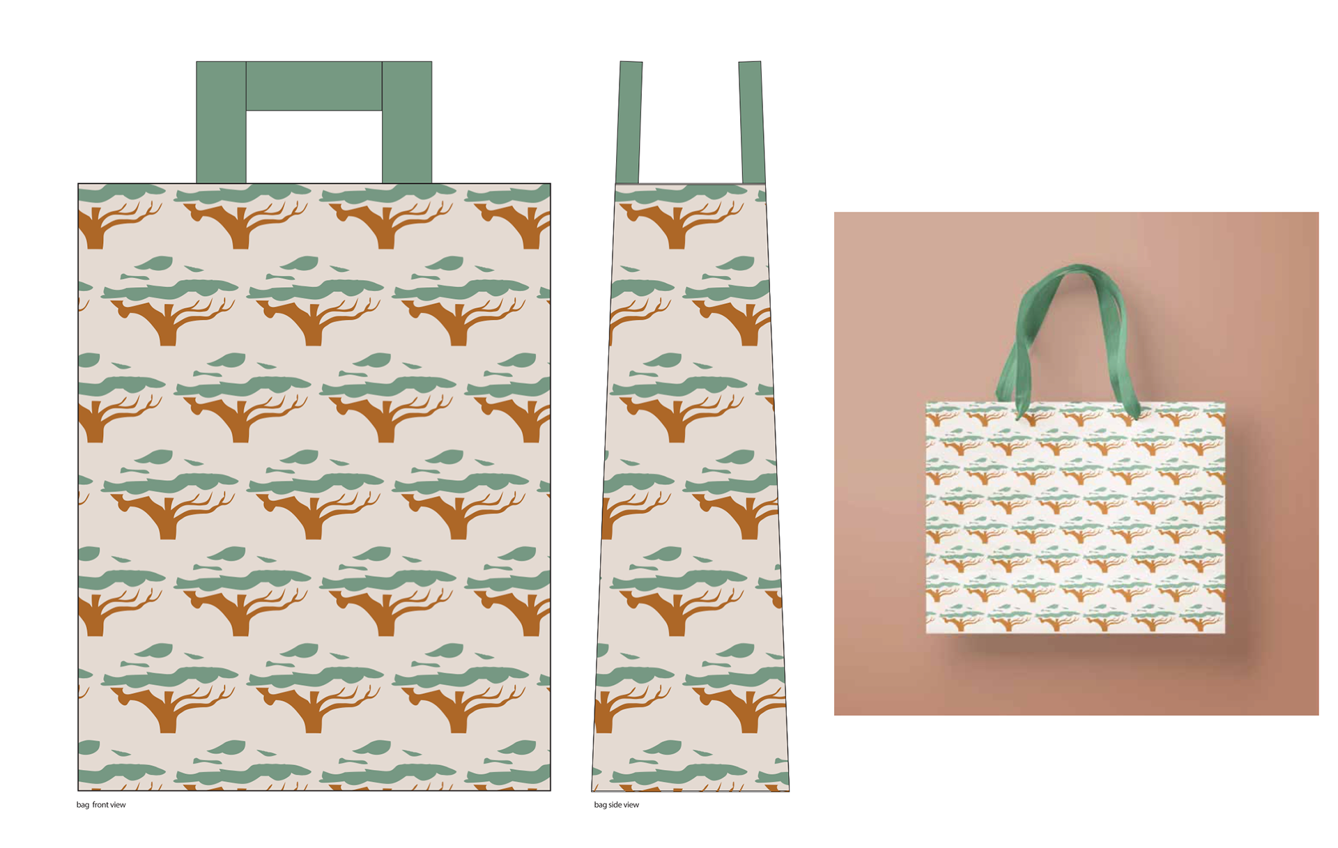
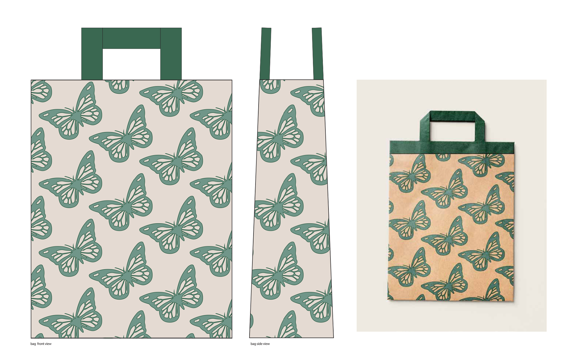
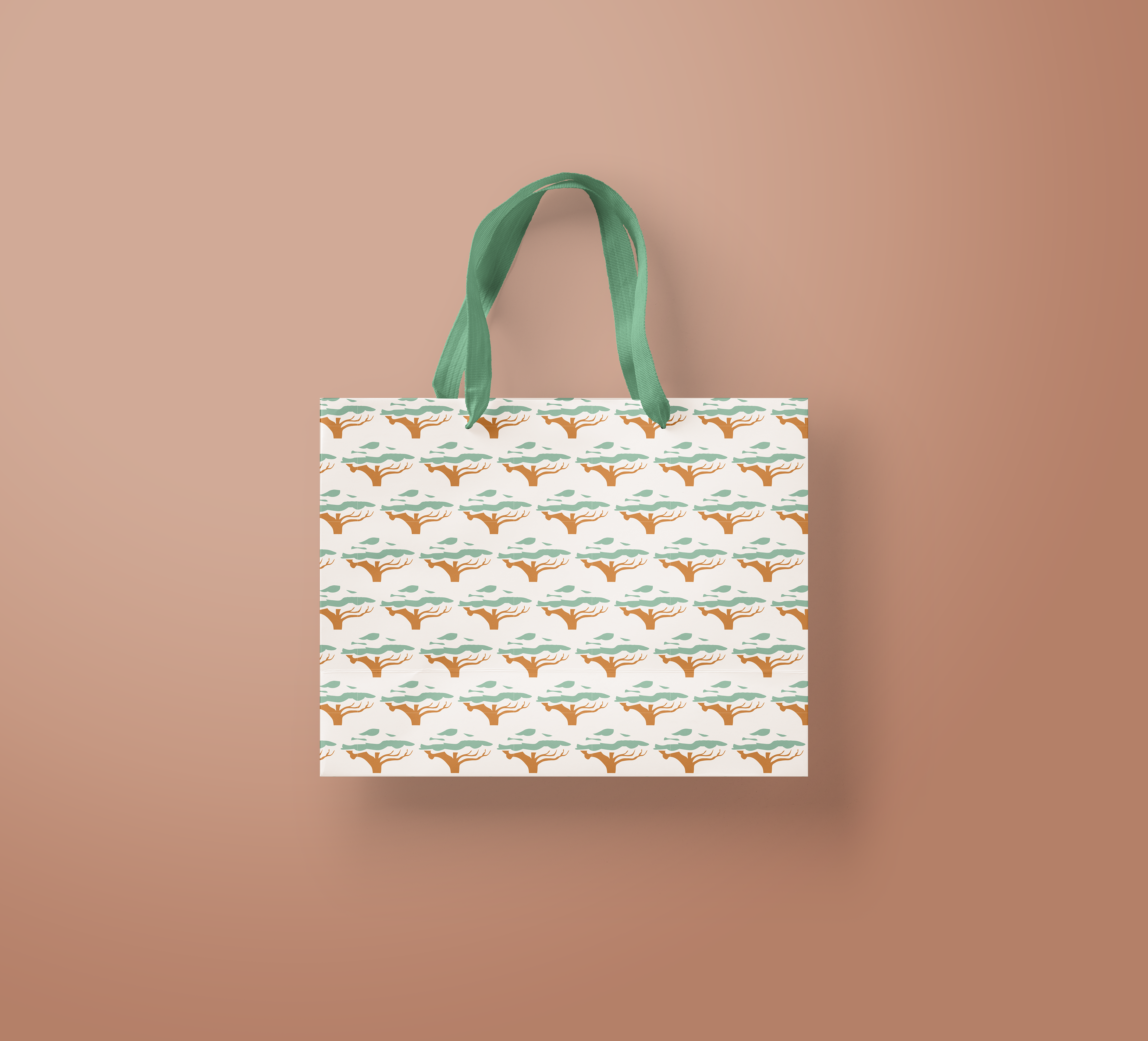
Using different color strokes and backgrounds, I was able to digitally compose four bags. From this point, I was chose two main patterns to promote these symbols.
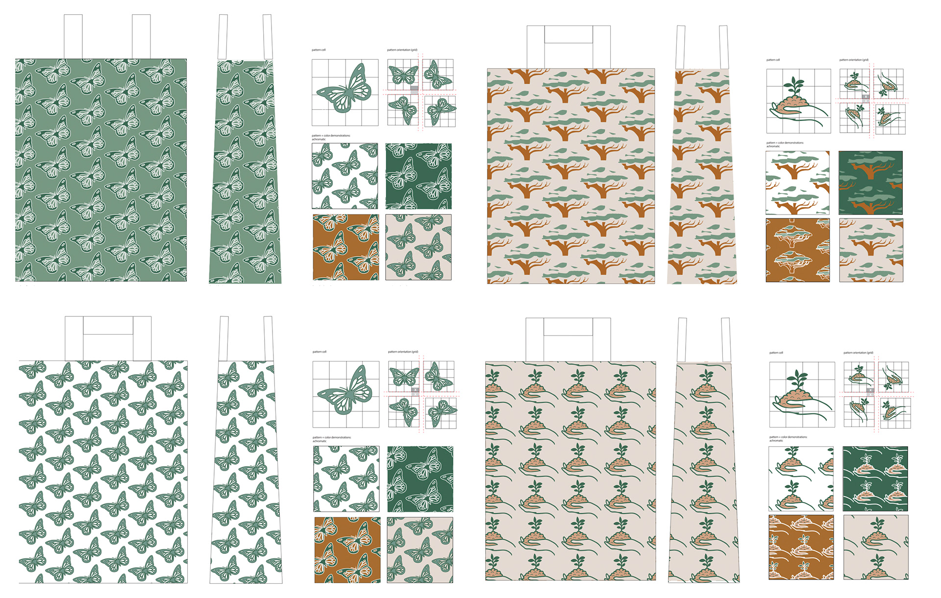
The two shopping bags are displayed in two visual representations, through mock-up templates for a 3D depiction and digitally- rendered in 2D.
Finally, I created a promotional poster that represented an event representing my symbol set. I also used a pastel color palette to portray a calm and aesthetically pleasing appeal to the poster. I composed three iterations of the poster to ponder my overall approach. Using graphic elements and typography, I was able to continue iterating one of the posters to construct a final poster.

Final Poster.