Project Overview
For this assignment, we were tasked to visually compose and rebrand a logo for a popular company of our choice and then create an animation to follow. My group and I chose collectively chose the brand "Lego" with their colorful color scheme and youthful community as a target audience.
Iteration
As we expanded on our visual concept strategy for the rebrand, we explored a variety of san-serif typefaces to embody the simplicity of the present brand mark. Highlighting on the action of "building blocks", we intended to incorporate that overall narrative into our motion design.
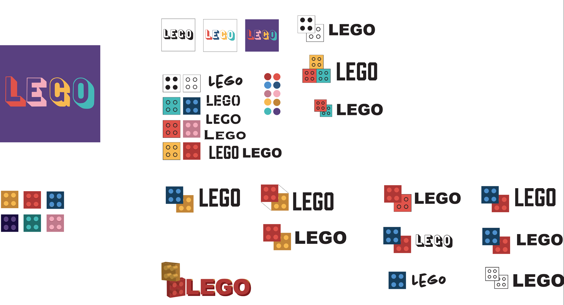
Example of some iterations for the mark, Lego.
Expanding on a bold, distinguishing color palette with six unique colors, I began to explore the concept of the 3D extrusion and typographic features to create more texture that resembles the dimension of a lego. I created three compositions for the mark, monochromatic, and positive and negative color sequences.
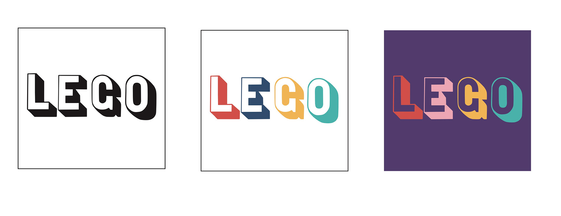
Three Final Mark Compositions.
A video of creating a video mockup of my animation in Adobe Photoshop.
Production
Using an unfamiliar software for this project such as Adobe Premiere, I watched many tutorials provided by our professor that provided insight on how to utilize the tools successfully achieve the desired composition. I created multiple drafts of concepts that I considered using for our animation.


Final COMPOSITION