
Project Overview
For this project I was tasked with tracking at least two data sets of my chosen interest in terms of their importance and potential correlations. Through visual analysis, I was able to uncover patterns and discern connections using comprehensive data to configure visual methods and analytical perspectives. I chose to track my screen time productivity and personal goals and productivity for two weeks and then visualize the data in a unique way. I was able apply what I learned in class and collect data using digital tracking devices and/or manual logging using a physical journal.
Data Collection
Primarily Research:
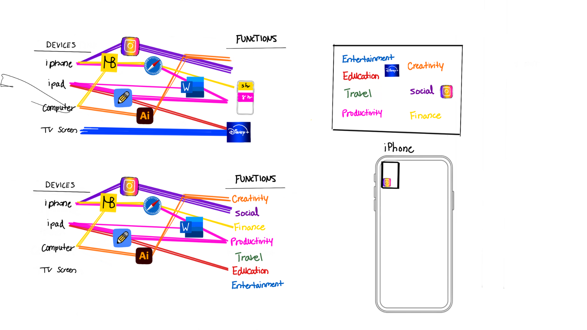
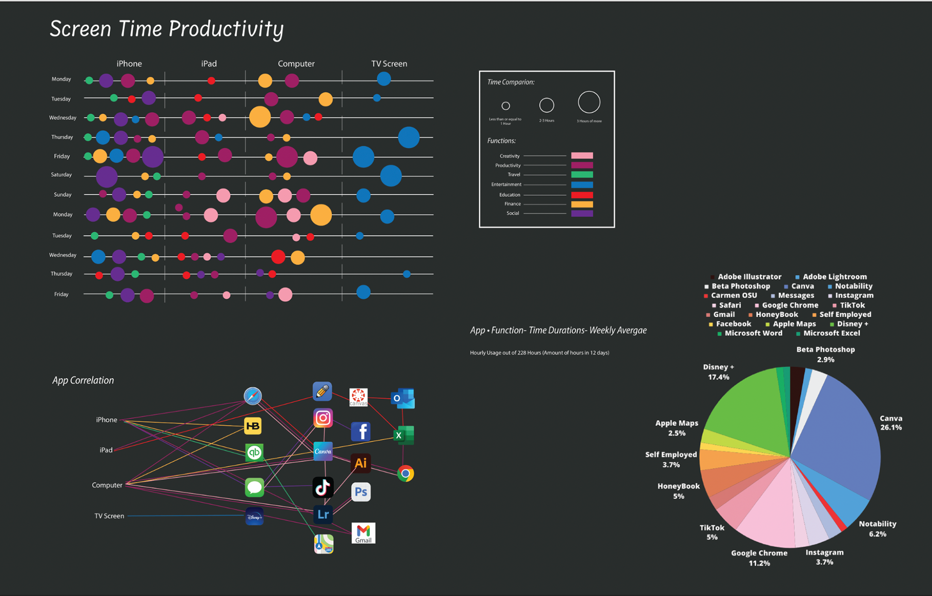
I prioritized tracking my daily usage of screen time and the correlation of how long I use certain devices for and what I use them for. I recorded my usage for the following devices: my computer, my iPhone, my iPad, and my living room TV Screen. In correlation to collecting the time duration spent on each device, I also recorded a series of functions such as Social, Entertainment, Education, Finance, Productivity, Creativity, and Travel; Followed by tracking the usage and time duration of each functionality within that device, in reference to the most commonly used digital software applications being used for that function. I collect my data point by digitally/manually logging them into Microsoft Excel. I attempted to daily collect data for a 15-day period but found my most accurate date within 12 of those days.


Examples of how I tracked screen time productivity and functionality on each device.
Secondary Research:
For my secondary data points, I decided to track my daily personal goals and productivity but manually logging my tasks within groupings, academic goals, personal goals, and work goals. In reference to my three goals, I recorded their correlation with levels of completion and achievability from easy, hard, and difficult. Overall, I collected my daily goals and tasks and manually colored coded them by completion or lack thereof. For instance, yellow was the indication of completion and orange ("Attempted) for incomplete. I then translated this data into Microsoft Excel for a clear understanding of their patterns and correlations.
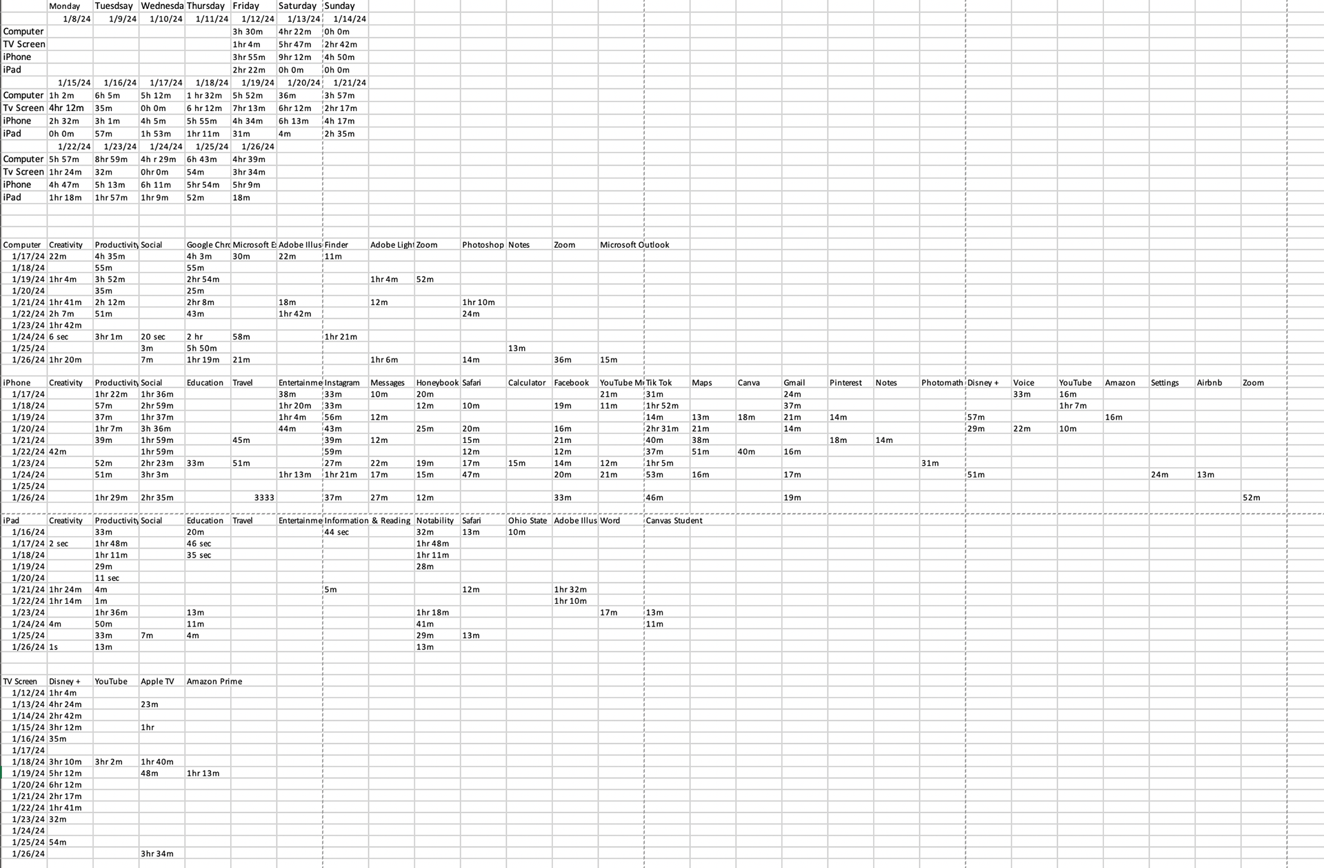
Screen Time Data Collection.
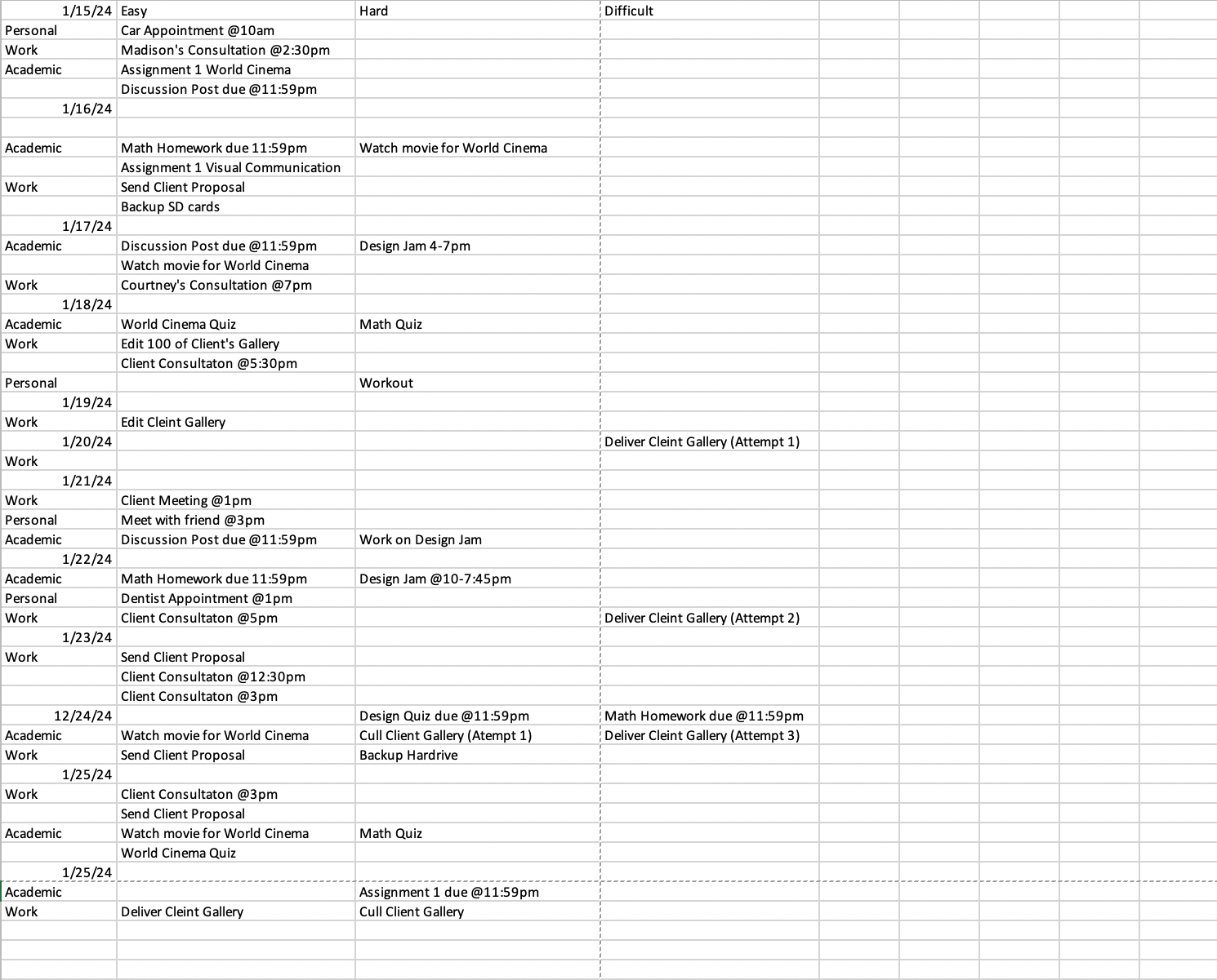
Personal Goals and Productivity Journal.
DATA ANALYSIS
Throughout my data collection, I discovered patterns in correlation to certain functions and the amount of increased usage based on specific days of the week. I primarily recorded the hourly usage and calculated difference of hours from 228 hours in 12 days. The tools used to record my screen time were pre-increment in my digital devices making it very accessibility to collect my data daily. Apple devices also automatically analyze the functionality of user's usage. For the personal journal, I individually would track my daily goals on a tangible daily planner and manually logged and categorized my goals digitally.
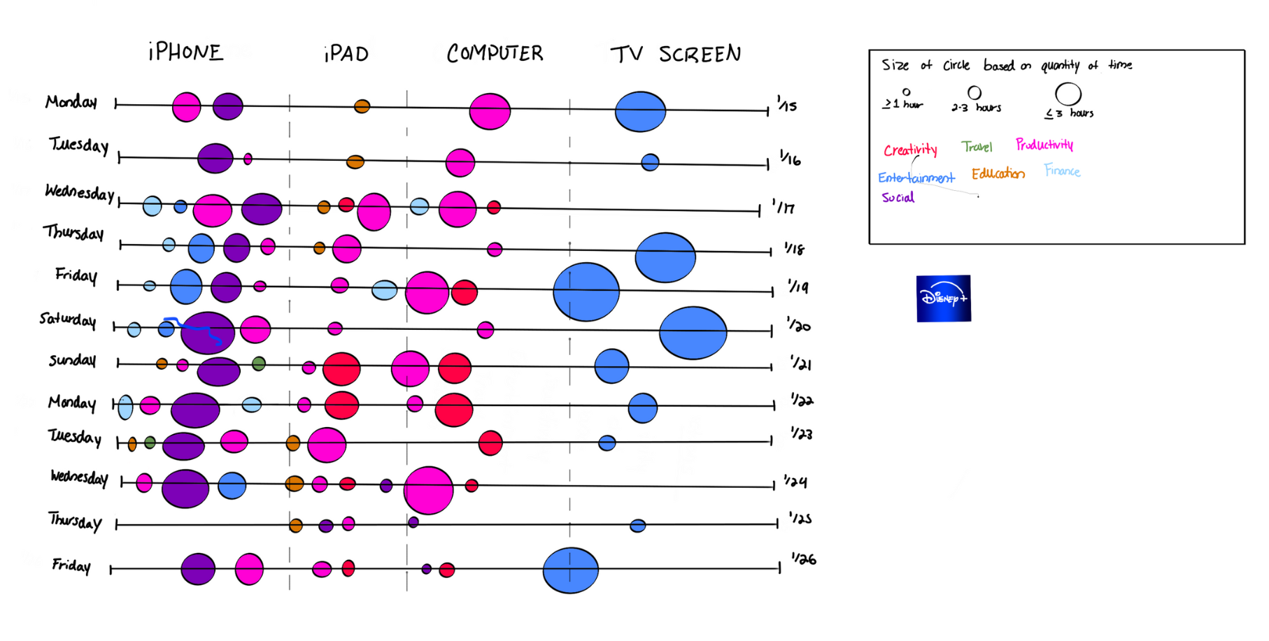
I began to create a series of iterations that visually represent the patterns and connections found within my data. I highlighted the use of color for hierarchy in distinguishing the functions within each device. The colors chosen to depict each function was composed with intentionality in reference to their app correlation. I also chose to use the enlargement and dilation of circles for a direct indication of time usage.
Production
I continued to strategize my patterns and color choices within my iterations. I explored visualization methods such as using digital devices at the foundation of the composition such as a TV screen or iPhone panel and continued towards a simplistic approach for accessible comprehension purposes for the audience. In the early stages of my process, strove to categorize the functions within each device and began to explore with linear configurations and basic rectangular forms.
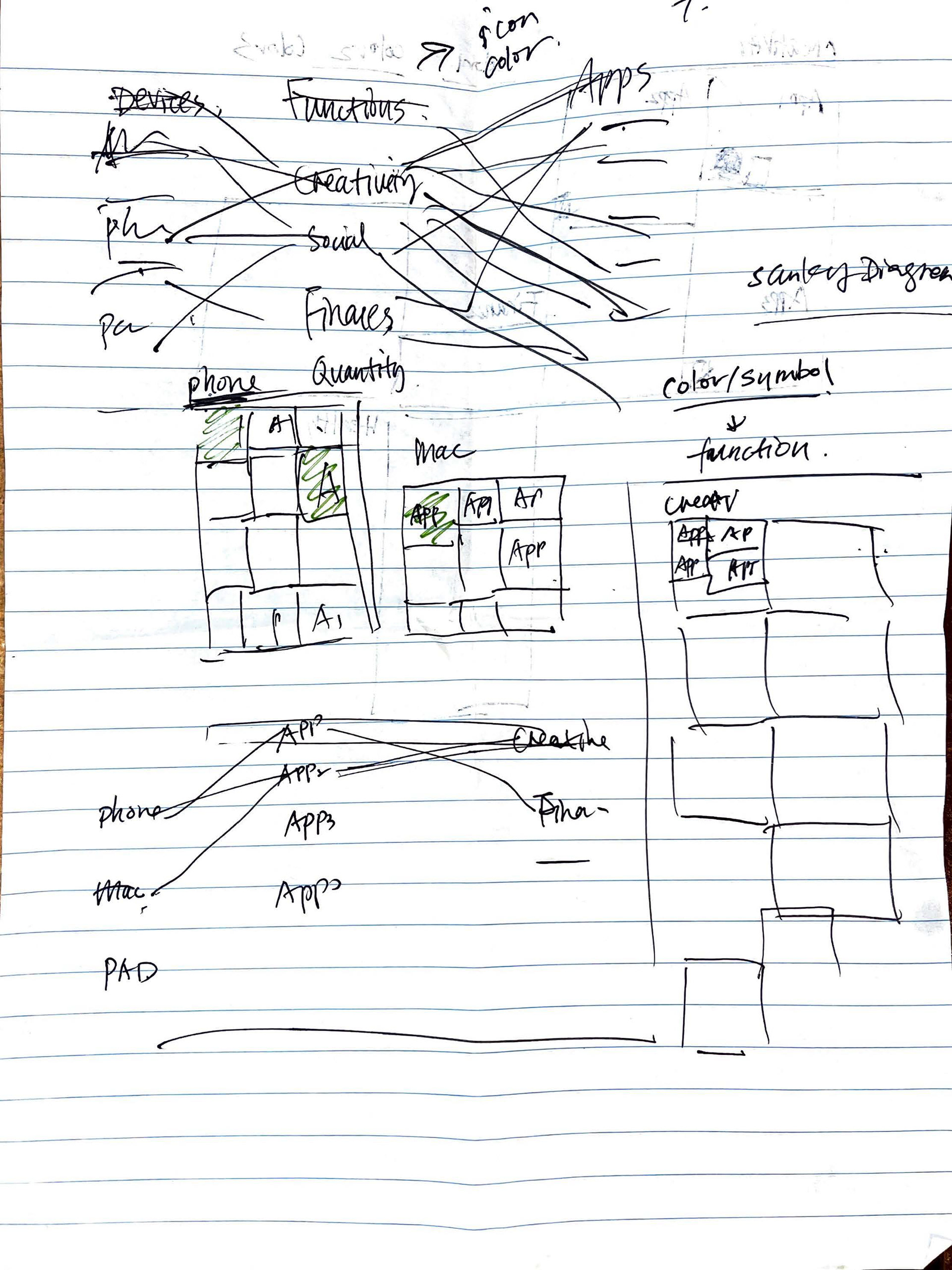

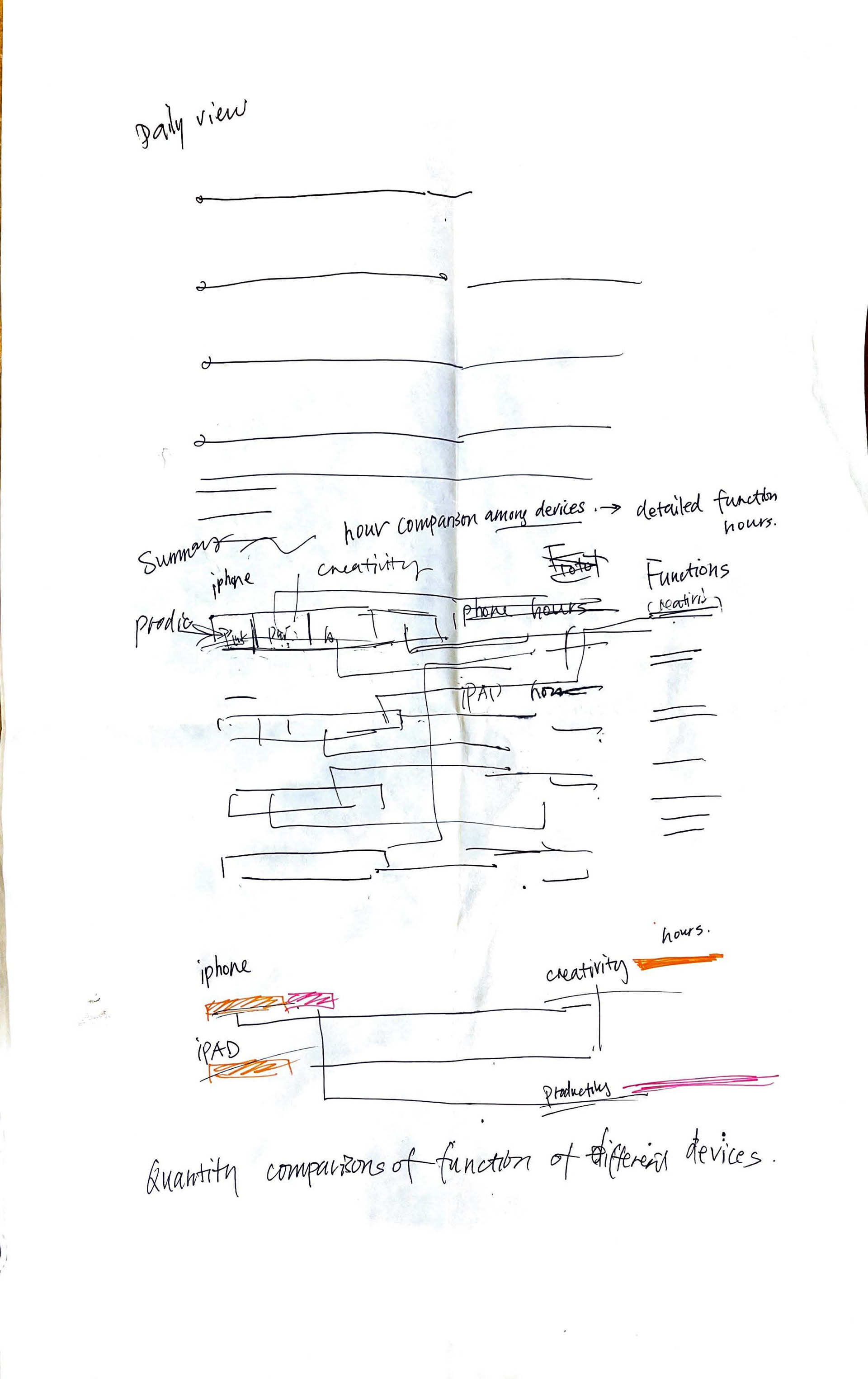
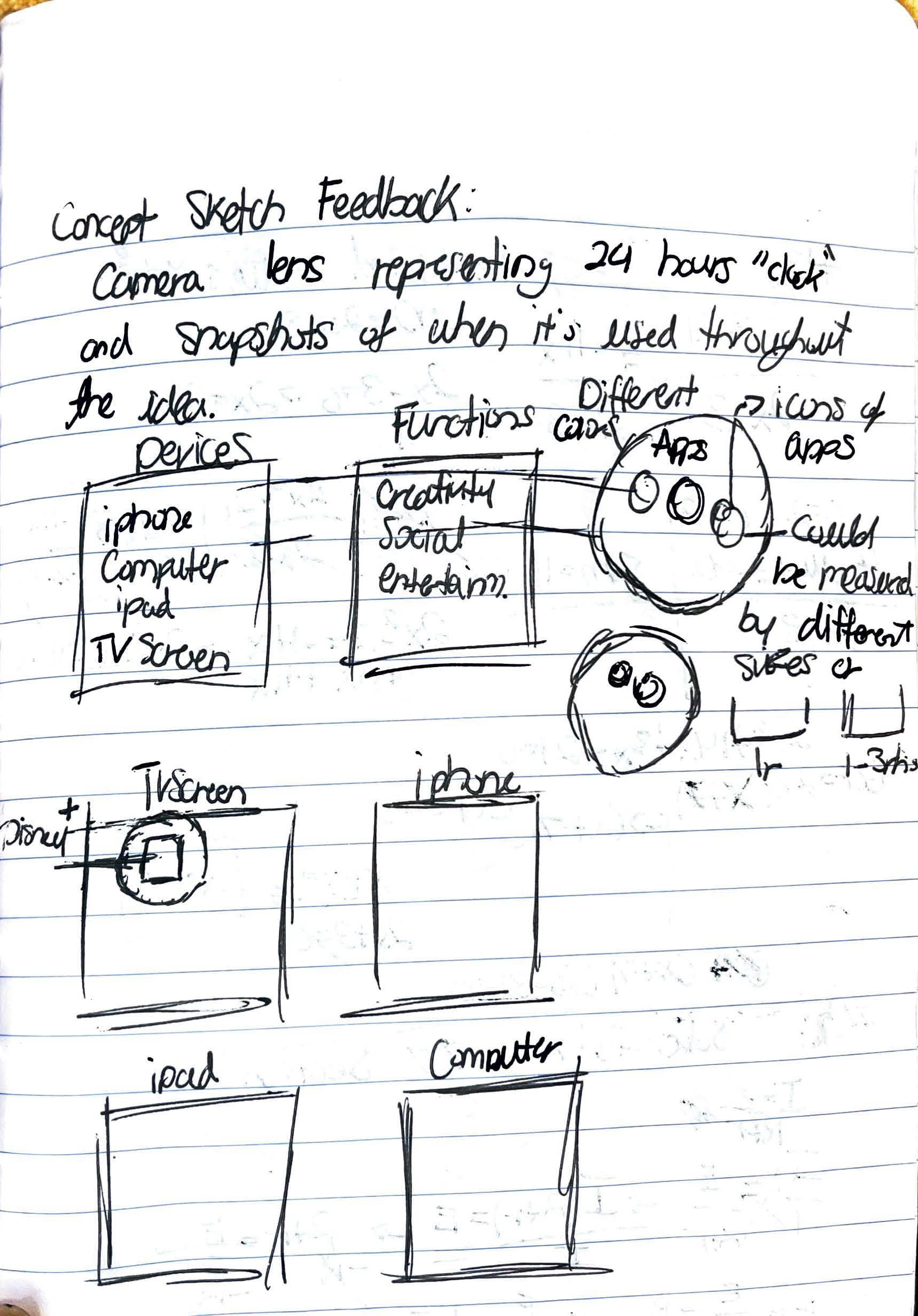
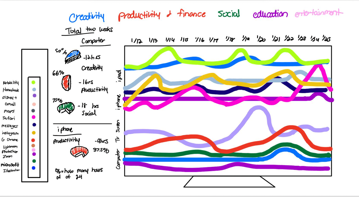
Continuing my conceptual development, I was provided feedback with how to strategize and explore various possibilities within visualizing my data effectively. It was difficult to find inspirational compositions with my iterations and focusing on an expansive amount of quantitative data. I focused graphic representations such as bar graphs, gantt chart, and a bubble chart. I found these visualization methods to be the most comprehensive and cohesive with collected data.


Final Design
My final composition visually represents the data collection and correlation between each device, its functionality, and digital application. I also applied the most commonly digital applications within their functionality and recorded the time duration spend on a daily average. Overall, this design effectively communicates my data through multiple principles such as the color selection being in association with the app's brand identity within that function. I came to the conclusion of using dark hues to instill hierarchy of device screen time and functionality productivity.

Final Design.
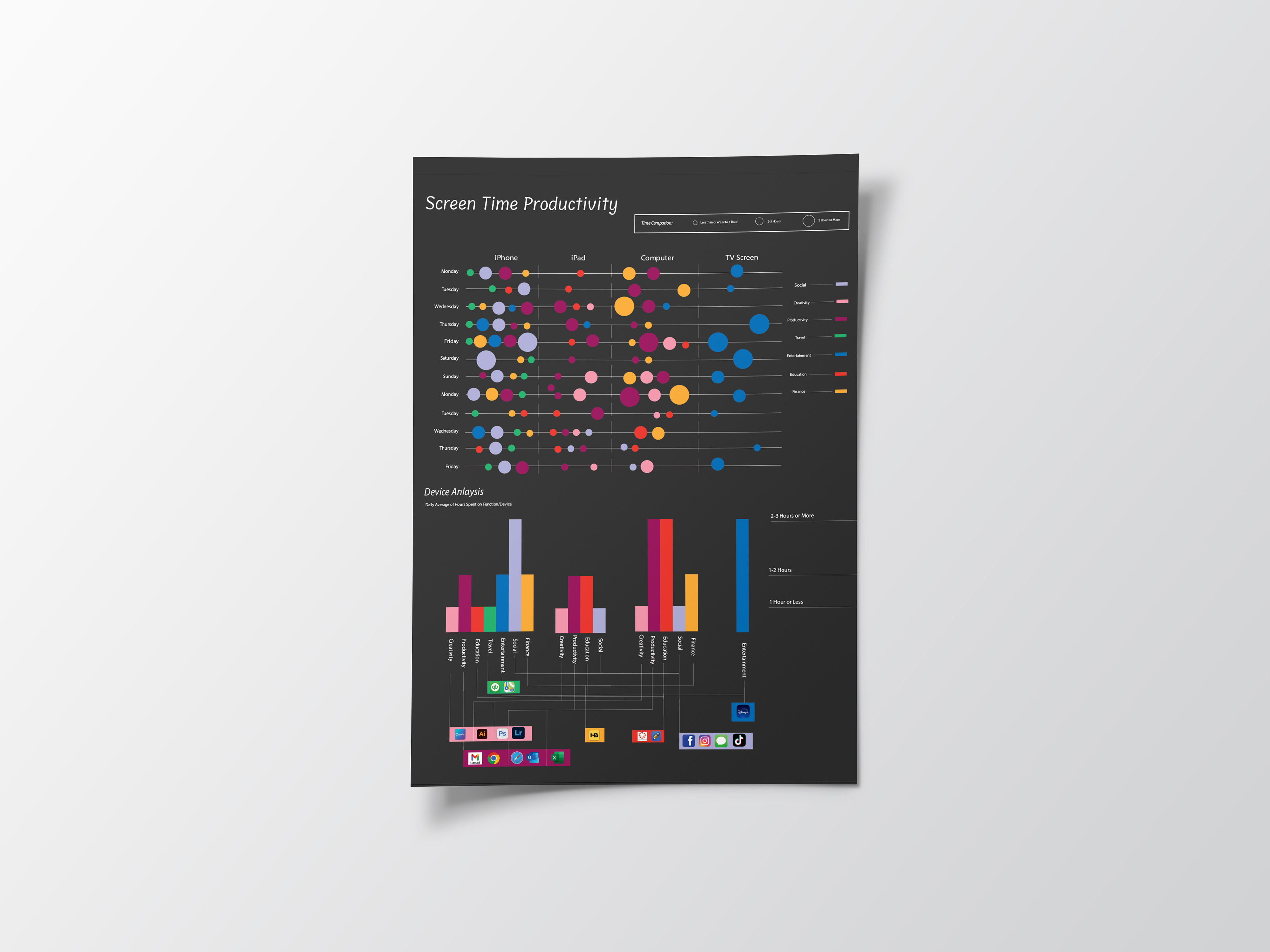
Mockup of Final Design.
Reflection
A few challenges I came across was solidifying a visualization method within my design process and iterations. With the feedback of my instructor, I able to construct a narrow pathway of exploration and attempt to achieve a visually compelling configuration that accurately represents the patterns within my data. Overall, this assignment was very skillfully and academically stimulating with it being my first time creating visual methods of quantitative self-collected data.